PROJECT OVERVIEW
The WPLC website is a professional development resource for women in medicine, but poor navigation and disorganized content created barriers.
I redesigned the site to simplify the navigation, highlight events and resources, and create a stronger information architecture, turning a 68.9% task success rate into a seamless (zero frustration) experience.
Role
Product designer / Solo project
Timeline
12 weeks / Spring 2025
Context
Academic project informed by my professional experience at HonorHealth.
Tools
Figma, Zoom, Google Forms
PROBLEM
The WPLC website is supposed to help women physicians find resources, events, and community. But it wasn’t working. After talking with members and visitors, three big problems stood out:
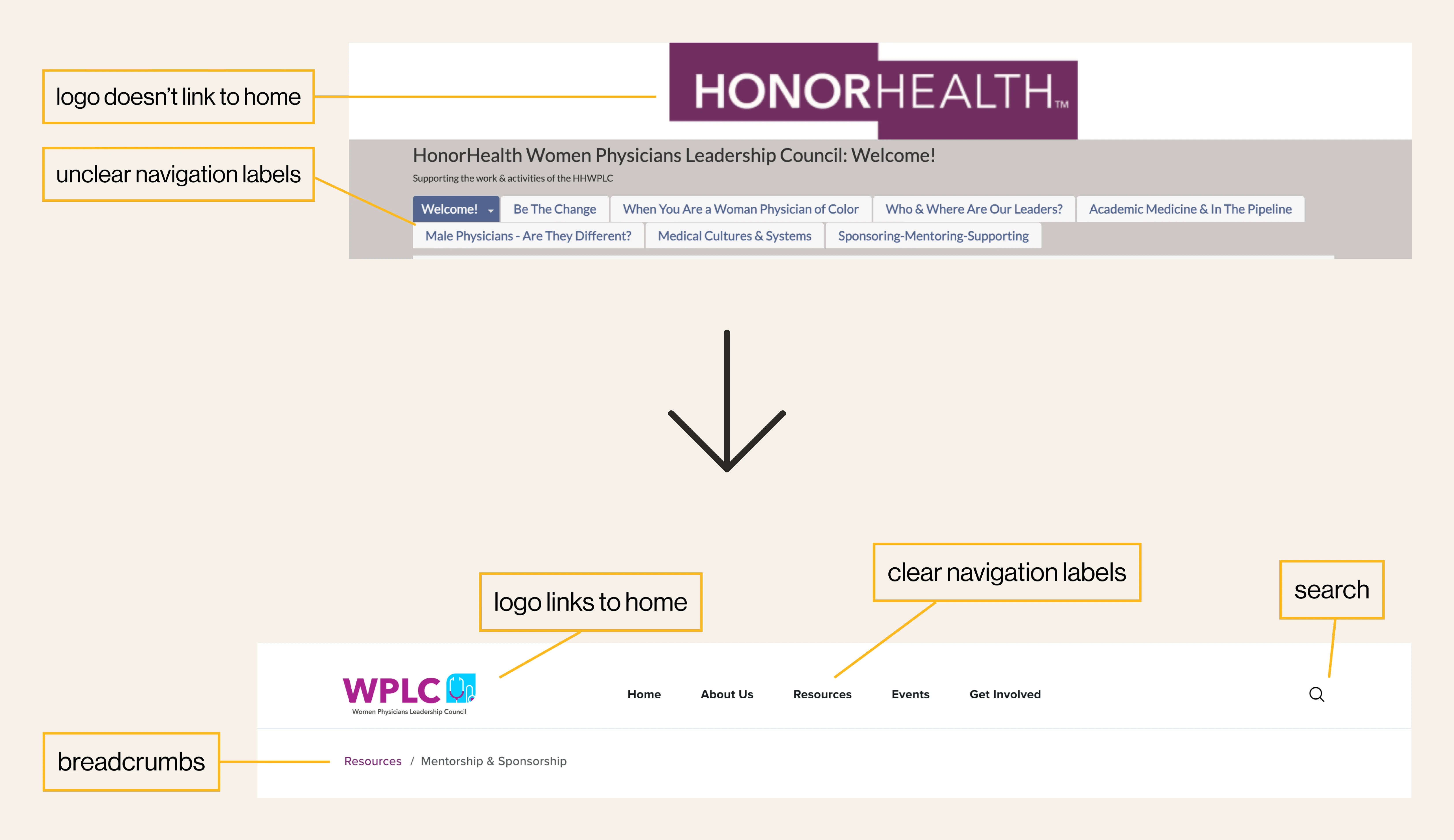
Menus, labels, and page hierarchy were confusing.
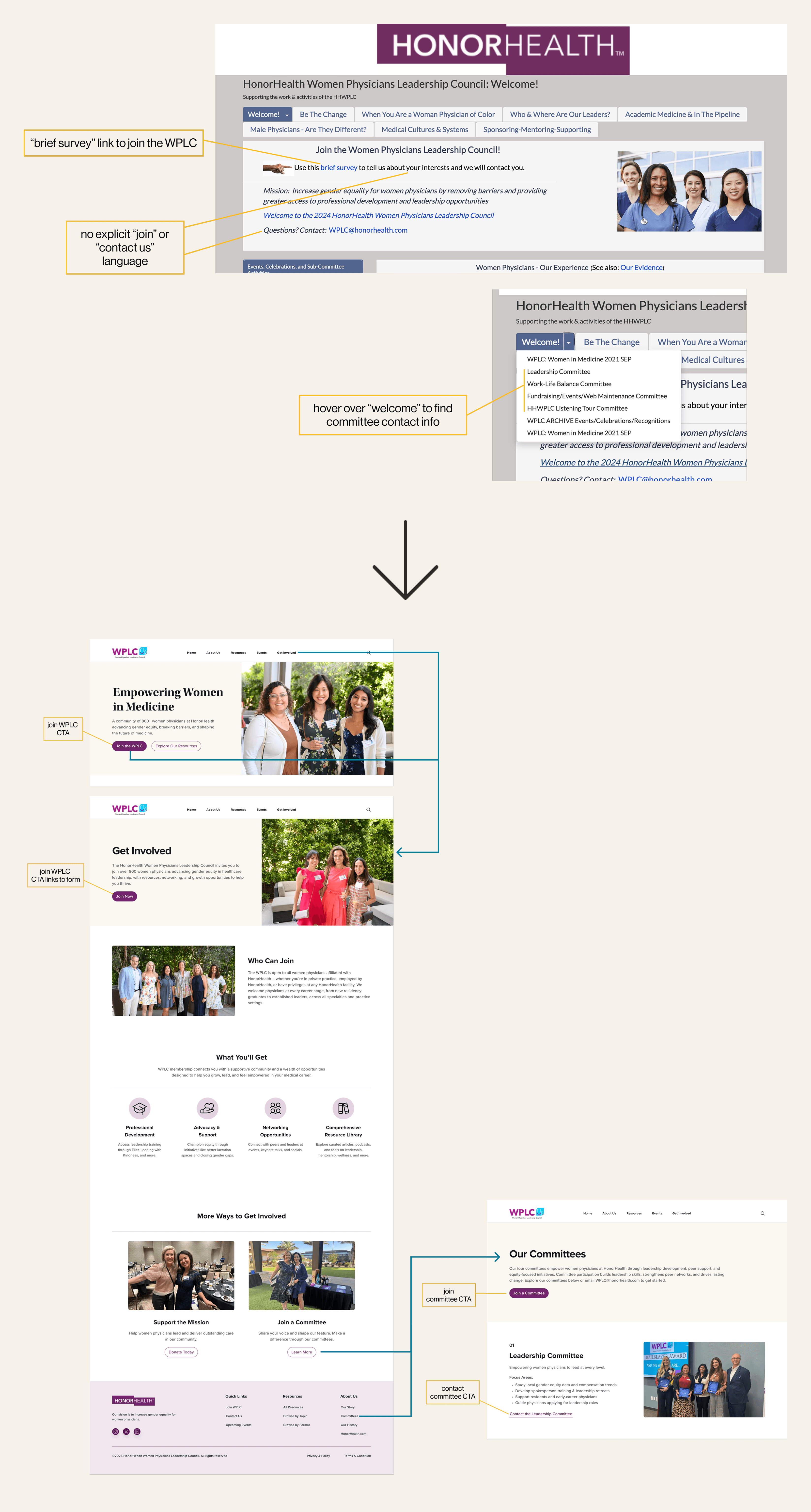
Joining, contacting, or signing up for events was buried.
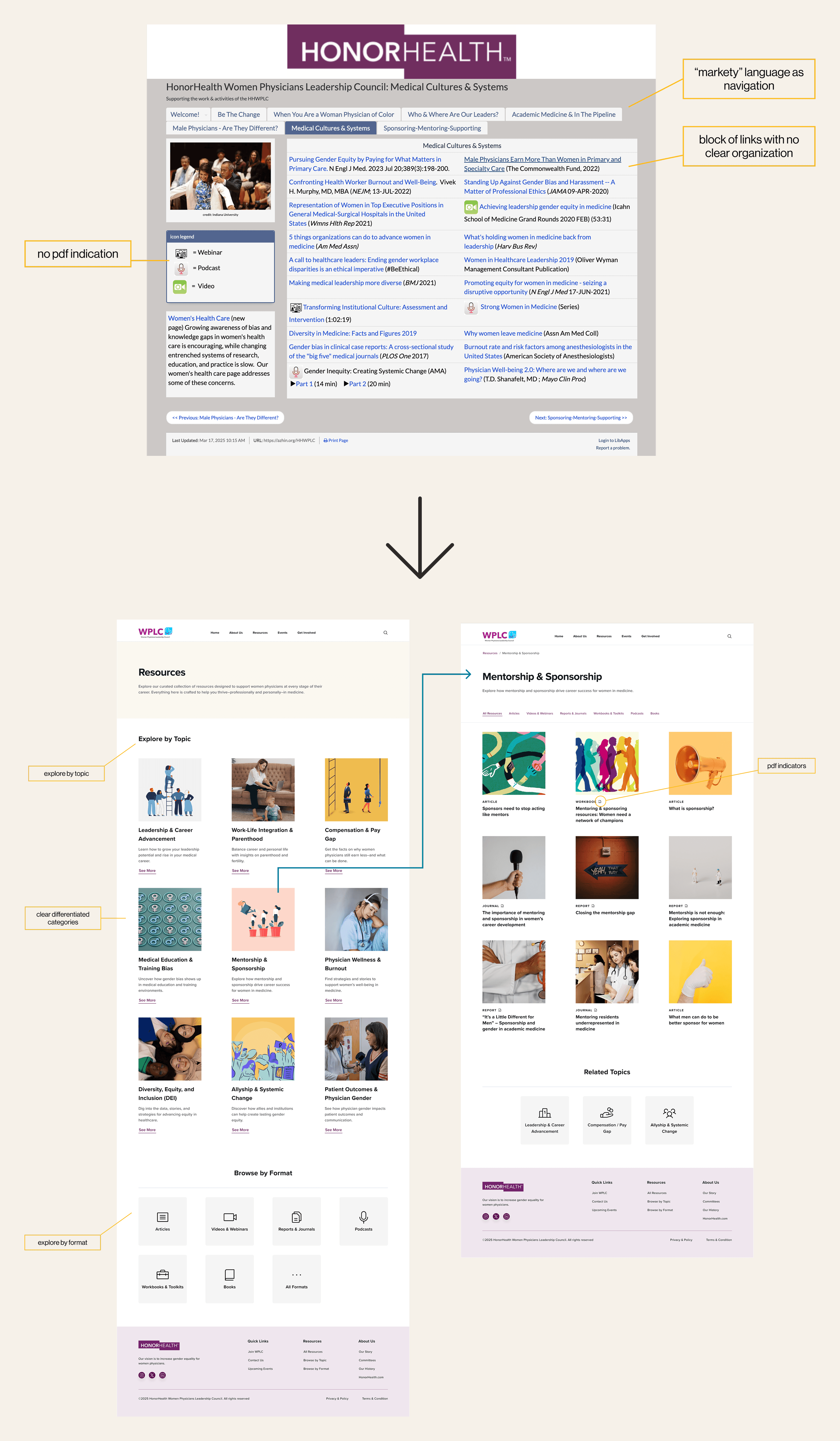
Resources were scattered across PDFs and pages.
The question
solution
Clear join and contact functionality


I started by combining four research methods to fully understand the scope of usability issues:
The accessibility audit identified 57 issues across 14 pages.
The site partially met Level A standards but didn’t comply with Level AA requirements.
The primary issues included missing or inadequate alt text, inconsistent heading structure, and missing warnings for PDF links that open in new windows.
I analyzed the site against Jakob Nielsen's 10 Usability Heuristics using Nielsen’s Severity Scale. This helped me catch the more obvious early and it gave me a helpful checklist to start.
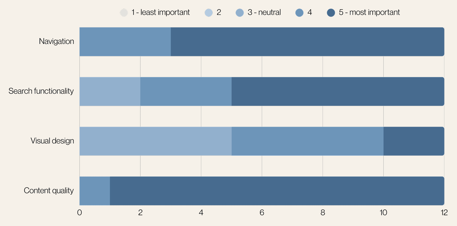
From my surveys and interviews, I found common themes and grouped them together. This led to the creation of four personas, which helped prioritize features and guide design decisions based on my research:
Dr. Vancouver: Research-oriented physician
Hannah: Medical student
Kylie: Marketing professional
Dean: Communications professional
average task time
longest task time
Unclear labels and confusing hierarchy
Too many links, no dedicated sections
Users tried Control+F as a workaround
Info buried in long PDFs, downloads without consent
Ease of use
60% rated “Difficult”
20% rated “Very Difficult”
Common feedback
Confusing
Unorganized
Messy
Outdated
Time-consuming
80% unlikely to return without improvements
Likelihood to return
IMPACT
If I could go back, I would include more testing with physician users and incorporate card sorting exercises to better understand their mental models. That said, the think-aloud protocol and mixed-methods approach gave me comprehensive insights to design with confidence.

